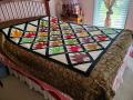
What's wrong with this quilt?
Subscribe
#61
FroggyinTexas , 11-20-2015 06:47 PM
Super Member
 04-18-2020
Quote:
Me, too! You might as well send it to me. I'm a woman and I have a room in my shelter that the quilt would fit perfectly. froggyintexas except now I'm froggyinNewMexico.Originally Posted by BETTY62
The only thing I see wrong is that it doesn't belong to me. I love it.
#62

playswithcolor , 11-20-2015 07:01 PM
Senior Member
Your quilt is nice as is, but to my eye the setting overpowers your 4 patch posie squares made from the paisley. ( I love paisleys). For me, I think it is the solid red, gold and green fabrics. Using print fabrics, especially for the center (red) strip of the setting blocks might have let the center squares shine more. Perhaps a bit more variety in value would help too. Red has lots of energy and can easily dominate a quilt.
#63
Well, I'm color blind, so my opinion doesn't mean that much...the green doesn't work for me! It seems kind of dull combined with the other fabrics. Please note that my color vision often doesn't allow me to see the 'true' color in a fabric. Before I knew I was color blind, I used to look at things and think "What were they thinking?" if the colors seemed off to me. Now I know that the problem is mine!
The four patch posies are superb! And, as many of the responders have said that they love the quilt and would take it off your hands, the green appearing dull to me falls under the category of 'my problem', not the quilts.
The four patch posies are superb! And, as many of the responders have said that they love the quilt and would take it off your hands, the green appearing dull to me falls under the category of 'my problem', not the quilts.
#64
quilting cat , 11-20-2015 10:25 PM
Super Member
The colors don't appeal to me, and it isn't soothing to look at -- so you're not alone. But someone at the shelter will love it, I'm sure!
#66
Battle Axe , 11-21-2015 05:40 AM
Super Member
Too much red. The value of the colors is too much alike. You don't have any dark or light versions of the colors. It is too strong and too bold. The workmanship looks really good and once you close your eyes it's all good.
#67

I really appreciate all your comments. I think Battle Axe summed up the problems of the quilt perfectly. Like many of you said, live, learn, donate, and move on.
#69

its the red it blends and screams as well at you. it was well put together but the green and tan just fade because of the red. it is a hard color to work with. well at least for me. hope this helps.
#70
quiltingbuddy , 11-21-2015 08:09 AM
Senior Member
I like it but feel like if it had just a small inner border of that same green to pull out from the middle to the edge for some repetition and consistency it would be perfect. If it were me I'd find a single fold binding at the store in that color and add it right on top. If it were right before the final border and it would balance very nicely. If you don't want to mess with it send it to me LoL.